Kit Design Inspiration: Fade Effect Football Kit Concept
Fade-effect football kits are the trend grassroots clubs keep asking for — here's how to do one that looks premium instead of dated.
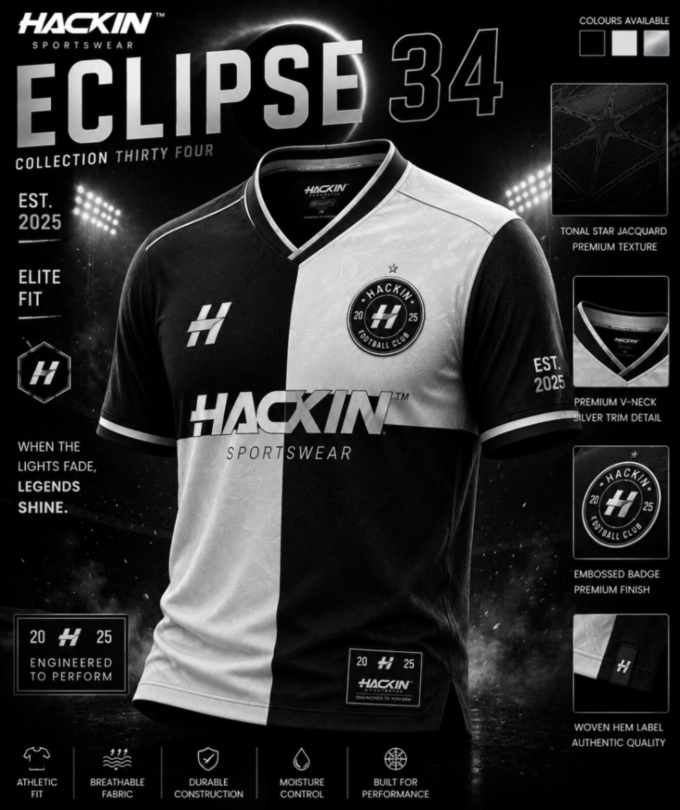
A well-executed fade can turn a basic football kit into something that genuinely stands out. A badly-executed one looks like a 2010s phone wallpaper. This week's Hackin concept shows how to land it on the right side of that line.
The Brief
The brief was a modern, high-impact home kit for a grassroots first team that's rebranding for the 2026/27 season. The club wanted "premium without being flashy" — a tough balance to strike, especially with a fade.
The Solution
A tone-on-tone vertical fade running from a deep base colour at the shoulders to a slightly lighter version of the same shade at the hem. No second colour fighting for attention — just controlled depth that catches the floodlights.
The badge, sponsor logos and numbers stay in a single contrasting accent, which keeps everything readable from the touchline.
Why It Works
Because the fade stays inside one colour family, the kit photographs beautifully and reproduces well on social media — even on the kind of low-light midweek pitches where most grassroots football actually happens.
Final Word
Want this concept in your club's colours? Send us your palette and we'll mock it up for free.
Hackin studio
Want a kit that looks this sharp?
Send us your badge, colours and sponsor logos — we’ll create a free custom kit concept for your club.
Request Your Free Kit DesignRelated club resources