The Psychology of Colour in Football Kit Design
How red, blue, black, purple and yellow influence football kit identity, player confidence, sponsor perception and visual intimidation.
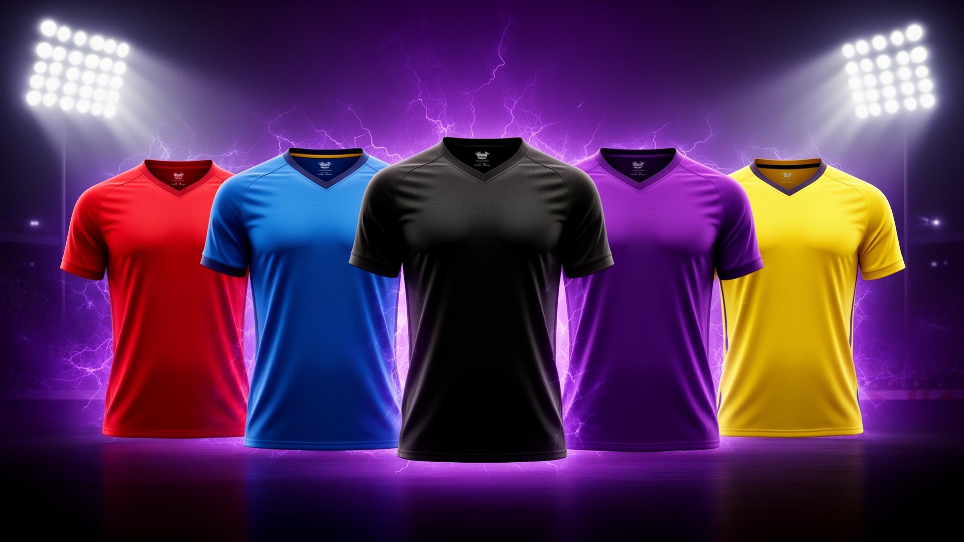
Colour changes how a football kit feels
Football kits are emotional. Before anyone reads a sponsor logo or notices a collar shape, they react to colour. Colour tells opponents, supporters and players what kind of team they are looking at.
That is why choosing kit colours should be a strategic decision, not just a preference.
Red: aggression and intensity
Red is fast, loud and confrontational. It suggests energy, pressure and attacking football. For teams that want to feel bold and relentless, red is a strong base or accent.
It works especially well with black, white or gold trims.
Blue: trust and control
Blue feels stable, disciplined and professional. Navy creates authority, royal blue feels classic, and electric blue adds speed.
For clubs looking to attract sponsors, blue can be useful because it feels reliable and corporate-friendly.
Black: dominance and focus
Black kits create instant presence. They feel serious, sharp and intimidating. A blackout kit can make even a simple design look premium.
The risk is flatness, so black works best with texture, tonal graphics or one strong accent colour.
Purple: creativity and difference
Purple is powerful because fewer clubs use it as a main identity colour. It feels creative, premium and modern. For a club that wants to stand out locally, purple can become a signature.
It also pairs beautifully with black, silver, white and neon accents.
Yellow: energy and visibility
Yellow is high-energy and highly visible. It feels optimistic, fast and confident. Used well, it creates a kit that pops in photos and on social media.
It is strongest as an away kit or accent colour unless the club already owns yellow as part of its identity.
Colour combinations matter more than single colours
The real psychology comes from combinations:
- black and purple: premium dominance
- red and black: aggression
- navy and white: tradition and trust
- yellow and black: visibility and edge
- blue and neon: speed and modernity
Fans need identity, not decoration
A colour system should help supporters recognise the club instantly. If the kit is too random, it may look exciting once but fail as a long-term identity.
The best designs balance emotion with consistency.
Use colour to set the season tone
A new kit can reset the mood of a squad. Choose colours that match the football you want to play, the sponsors you want to attract and the identity you want players to feel proud wearing.
Hackin studio
Choose a kit style that changes how your team feels.
Explore bold patterns, blackout looks, retro fusions and colour systems built for confident teams.
Explore Our Design StylesFAQs
What is the best colour for a football kit?
There is no single best colour. Red feels aggressive, blue feels trustworthy, black feels dominant, purple feels creative and yellow feels energetic.
Related club resources